Mailchimp
/Sr. Director of Design
When the hallway became the design review
Mailchimp was an email company becoming a marketing platform. The rebrand told the market a new story — but inside the product, brand design and product design were speaking different languages. The experience didn’t feel like one thing. It felt like six things stitched together.
Context
Market forces were pushing Mailchimp from email into an all-in-one marketing platform. The rebrand was the signal to the market — but the product experience didn’t match the ambition. A competitive audit against Airtable, Shopify, and Squarespace exposed the gap: jarring color shifts between pages, inconsistent typography, a dashboard that competed with itself for attention, and a product that lacked the structural “container” competitors used to create coherence.
Brand design and product design operated in silos. Marketing shipped beautiful campaigns. Product shipped functional screens. Nobody was responsible for the seam between them. The teams weren’t misaligned on goals — they were misaligned on process. Design decisions were made in private and revealed in reviews, which meant feedback came too late to be useful and cross-team influence was accidental.
Approach
Made the work public. Posted wireframes and in-progress designs in the hallways and common spaces — not for sign-off, but for collision. When people could see the work forming, they pulled themselves in. Brand designers gave product feedback. Product designers absorbed brand language. The formal review became a ratification of decisions that had already been shaped by the right people, not the first time stakeholders saw the work.
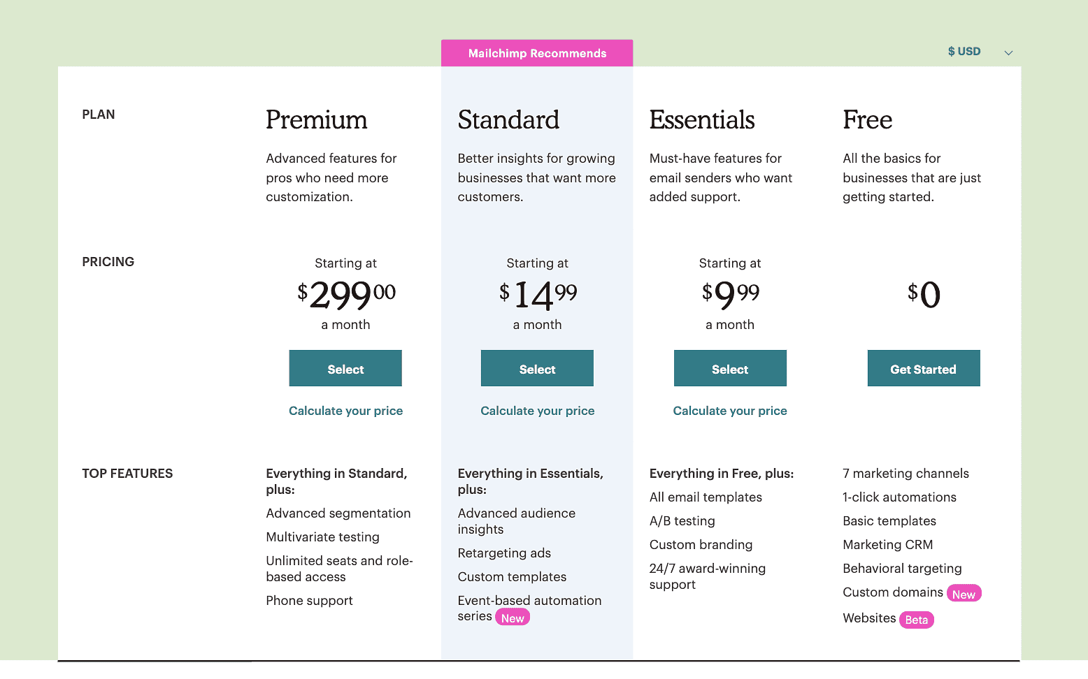
Led experience strategy and pricing strategy for the platform transition. Ran a competitive UX audit that gave the team shared evidence instead of competing opinions — Mailchimp’s dashboard had 6 CTAs where competitors had 4, the product lacked a visual container, and the most important action on the page had the least visual weight. That audit became the design brief the team rallied around.
Shipped Social Start — a feature that let new users begin from social media instead of defaulting into email. This was the first product expression of the “all-in-one” positioning. Also moved Content Strategy under the design function, which connected messaging to experience at the structural level.
Tradeoffs
Scope vs. depth
The platform transition touched everything — pricing, onboarding, feature discovery, brand expression. Chose breadth over depth in the first pass to establish the experience framework. Some individual surfaces shipped with less refinement than they deserved.
Working in public
Hallway wireframes and open process created healthy collisions, but also noise. Not every passerby’s opinion was useful, and managing the signal-to-noise ratio took more facilitation than expected.
Org design
Moving Content Strategy under Design was the right structural call, but it created friction with the marketing team who’d owned that function. The transition required more relationship management than the org chart change implied.
Outcomes
+90% YoY
Paid subscriptions
Year-over-year growth in new paid subscriptions during the platform transition
Design-led
Content Strategy
Moved Content Strategy under Design, increasing strategic output by connecting messaging to experience
“Ian is an effective and strategic design leader who prioritizes people and business outcomes. He is able to quickly understand complex ecosystems, competitively interpret business opportunities and bring others along with crafted storytelling.”
Brandy Porter, Director of Brand Design, Mailchimp